1
2
3
4
5
6
7
8
9
10
11
12
13
14
15
16
17
18
19
20
21
22
23
24
25
26
27
28
29
30
31
32
33
34
35
36
37
38
39
40
41
42
43
44
45
46
47
48
49
50
51
52
53
54
55
56
57
58
59
60
61
62
63
64
65
66
67
68
69
70
71
72
73
74
75
76
77
78
79
80
81
82
83
84
85
86
87
88
89
90
91
92
93
94
95
96
97
98
99
100
101
102
103
104
105
106
107
|
---
title: 'Altair: Interactive Statistical Visualizations for Python'
tags:
- Python
- visualization
- statistics
- Jupyter
authors:
- name: Jacob VanderPlas
orcid: 0000-0002-9623-3401
affiliation: 1
- name: Brian E. Granger
orcid: 0000-0002-5223-6168
affiliation: 2
- name: Jeffrey Heer
orcid: 0000-0002-6175-1655
affiliation: 1
- name: Dominik Moritz
orcid: 0000-0002-3110-1053
affiliation: 1
- name: Kanit Wongsuphasawat
orcid: 0000-0001-7231-279X
affiliation: 1
- name: Arvind Satyanarayan
orcid: 0000-0001-5564-635X
affiliation: 3
- name: Eitan Lees
orcid: 0000-0003-0988-6015
affiliation: 4
- name: Ilia Timofeev
orcid: 0000-0003-1795-943X
affiliation: 5
- name: Ben Welsh
orcid: 0000-0002-5200-7269
affiliation: 6
- name: Scott Sievert
orcid: 0000-0002-4275-3452
affiliation: 7
affiliations:
- name: University of Washington
index: 1
- name: California Polytechnic State University, San Luis Obispo
index: 2
- name: MIT CSAIL
index: 3
- name: Florida State University
index: 4
- name: TTS Consulting
index: 5
- name: Los Angeles Times Data Desk
index: 6
- name: University of Wisconsin--Madison
index: 7
date: 07 August 2018
bibliography: paper.bib
---
# Summary
Altair is a declarative statistical visualization library for Python.
Statistical visualization is a constrained subset of data visualization focused on the creation of visualizations
that are helpful in statistical modeling. The constrained model of statistical visualization is usually expressed
in terms of a visualization grammar [@2005-grammar] that specifies how input data is transformed and mapped to visual
properties (position, color, size, etc.).
Altair is based on the Vega-Lite visualization grammar [@2017-vega-lite], which allows a wide range of statistical
visualizations to be expressed using a small number of grammar primitives. Vega-Lite implements a view composition
algebra in conjunction with a novel grammar of interactions that allow users to specify interactive charts in a few
lines of code. Vega-Lite is declarative; visualizations are specified using JSON data that follows the
[Vega-Lite JSON schema](https://github.com/vega/schema). As a Python library, Altair provides an API oriented towards
scientists and data scientists doing exploratory data analysis [@1977-exploratory]. Altair's Python API emits Vega-Lite
JSON data, which is then rendered in a user-interface such as the Jupyter Notebook, JupyterLab, or nteract using the
[Vega-Lite JavaScript library](https://vega.github.io/vega-lite/). Vega-Lite JSON is compiled to a full Vega
specification [@2016-reactive-vega-architecture], which is then parsed and executed using a reactive runtime that
internally makes use of D3.js [@2011-d3].
The declarative nature of the Vega-Lite visualization grammar [@2005-grammar; @2017-vega-lite], and its encoding in a
formal JSON schema, provide Altair with a number of benefits. First, much of the Altair Python code and tests are
generated from the Vega-Lite JSON schema, ensuring strict conformance with the Vega-Lite specification. Second, the JSON
data produced by Altair and consumed by Vega-Lite provides a natural serialization and file format for statistical
visualizations. This is leveraged by JupyterLab, which provides built-in rendering of these files. Third, the JSON data
provides a clean integration point for non-programming based visualization user-interfaces such as Voyager
[@2016-voyager;@2017-voyager2].
In addition to [static documentation](https://altair-viz.github.io/), Altair includes a set of Jupyter Notebooks with
examples and an interactive tutorial. These notebooks can be read by anyone with only a web-browser through
[binder](https://mybinder.org/).
-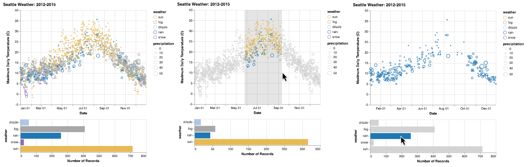
The example above is an interactive Altair visualization of the weather in Seattle. The plot on the *left* shows the
initial state: a scatterplot showing the temperature and dominant weather type between January and December, and a bar
chart showing the counts grouped by weather type. The plot in the *middle* shows a brush that the user has drawn to
focus on the summers; which are dominantly sunny. In the last plot on the *right*, the user has clicked on the a bar
to filter the scatterplot.
These interactions are achieved through two selections: an interval selection on the scatterplot and a multi selection
on the bar chart. The selections drive filters in the other plot. The code for this and other examples is in the
[Altair gallery](https://altair-viz.github.io/gallery/).
# Acknowledgements
We thank the many contributors that created examples, wrote documentation, and reported bugs. You can find [an up-to-date
list of contributors on GitHub](https://github.com/altair-viz/altair/graphs/contributors).
# References
|
