documentation index ◦ reference manual ◦ function index
Contents |
Customizing the Interface
In Ren'Py, there are four ways that one can customize the out-of-game menus:
- Layouts control the feel of the various screens that make up the game menu. They control the placement of components on those screen, and what those components do if they interact.
- Themes control the look of buttons, bars, frames, labels, and prompts.
- One can customize the main and game menus to add additional choices to those menus, over and above the ones provided by the layouts.
- Finally, one can use the style system to further customize the look and layout of the various out-of-game menu screens.
Of these, the only mandatory customization is the selection of a theme.
Order of Customizations
We expect customization of the game to occur in the following order:
- If necessary, setting the script version (config.script_version), screen width (config.screen_width). and screen height (config.screen_height).
- If necessary, selecting one or more layouts.
- Selecting a master theme.
- If necessary, selecting one or more theme components that override portions of the master theme.
- If necessary, customize the main and game menus, and using the style system to further customize the interface.
Layouts
Layouts control the feel of the out-of-game menus. There are five main kinds of layouts:
- main_menu layouts control the feel of the main menu.
- navigation layouts control the feel of the game menu navigation.
- load_save layouts control the feel of the load and save screens.
- yesno_prompt layouts control the feel of asking the user a yes or no question.
- preferences layouts control the feel of the preference screens.
- joystick_preferences layouts control the feel of the joystick preference screens.
There are also standalone layouts which do not fall into any of these categories. While a game needs exactly one of each of the five main kinds of layouts to function properly, it can have as many standalone layouts as it needs.
Each kind of layout provides certain functionality to the interface. The functionality provided by each kind of layout is described below. The selection of layouts is expected to occur before the selection of a theme. If no layout of a given kind is selected, then the classic variant is used. For example, if no yesno_prompt layout has been selected, then layout.classic_yesno_prompt is used.
Note that there are combinations of layouts and themes that will not look reasonable together. This is not a bug... it's impossible to have every layout work with every other layout and every theme, and still have an unlimited range of layouts and themes. Caveat factor.
main_menu layouts
The main_menu layouts are responsible for defining the look of the main menu. This includes the background of the main menu, and the buttons that are used to go to the game menu or start a game.
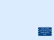
| Function: | layout.classic_main_menu | (): |
This displays the classic main menu, which stacks the main menu buttons vertically.
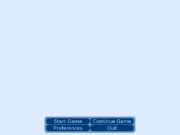
| Function: | layout.grouped_main_menu | (): |
This defines a main menu layout that groups buttons into rows horizontally, and then stacks those rows vertically.
| Variable: | config.main_menu_per_group | = 2 |
The number of buttons placed in to each horizontal row.
| Function: | layout.imagemap_main_menu | (ground, selected, hotspots, idle=None, variant=None): |
ground - The ground image. This is used for parts of the screen that are not defined.
selected - The selected image. This used for hotspots that are hovered.
hotspots - A list of tuples defining the hotspot. Each tuple consists of:
- The x-coordinate of the left side.
- The y-coordinate of the top side.
- The x-coordinate of the right side.
- The y-coordinate of the bottom side.
- Either the (untranslated) name of the main menu button this hotspot is equivalent to, or, a label in the program to jump to when this hotspot is clicked.
idle - If not None, an image that is used for images that are not hovered. If this is None, it defaults to ground. (new in 6.10.1)
variant - The variant of the main menu to define. The variable _main_menu_variant is used to select a variant to show to the user. (new in 6.10.1)
Despite the name, this function can take arbitrary displayables (like Animations) as well as images.
navigation layouts
The navigation layouts are responsible for defining the navigation through the game menu. This includes the background of the game menus and the buttons that are used to go between game menu screens.
| Function: | layout.classic_navigation | (): |
This displays the navigation buttons in a vertical box.
| Function: | layout.grouped_navigation | (): |
This displays the navigation buttons in horizontal groups, which are then stacked vertically.
| Variable: | config.navigation_per_group | = 2 |
The number of navigation buttons per horizontal group.
| Function: | layout.imagemap_navigation | (ground, idle, hover, selected_idle, selected_hover, hotspots): |
This layout uses an imagemap to handle game menu navigation.
ground - The displayable used for disabled buttons, and areas that are not in a hotspot.
idle - The displayable used for unfocused unselected hotspots.
hover - The displayable used for focused unselected hotspots.
selected_idle - The displayable used for unfocused selected hotspots.
selected_hover - The displayable used for focused selected hotspots.
hotspots - A list of tuples defining the hotspots. Each tuple consists of
- The x-coordinate of the left side.
- The y-coordinate of the top side.
- The x-coordinate of the right side.
- The y-coordinate of the bottom side.
- The (untranslated) name of the game menu button this hotspot is equivalent to.
Despite the name, this function can take arbitrary displayables as well as images.
load_save layouts
The load_save layouts are responsible for defining the load and save screens.
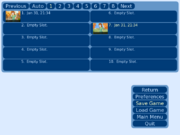
| Function: | layout.classic_load_save | (): |
This layout displays the the load and save screens as having a certain number of rows and columns of slots, with a row of navigation buttons on top.
| Variable: | config.file_page_rows | = 5 |
The number of rows of file slots to display.
| Variable: | config.file_page_cols | = 2 |
The number of columns of file slots to display.
| Variable: | config.file_quick_access_pages | = 8 |
The number of pages of files to provide quick access buttons for.
| Variable: | config.disable_file_pager | = False |
If True, the pager is disabled. This prevents access to pages other than the first page of files.
| Variable: | config.disable_thumbnails | = False |
If True, thumbnails are not shown.
| Variable: | config.load_save_empty_thumbnail | = None |
If not None, this should be a displayable that will be shown with empty load/save slots.
| Variable: | config.time_format | = "%b %d, %H:%M" |
The format used for file times in the file entry slots.
| Variable: | config.file_entry_format | = "%(time)s\n%(save_name)s" |
The format of file entries in the file entry slots.
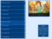
| Function: | layout.scrolling_load_save | (): |
This uses a scrolling area that contains file picker entries. The user picks one of these entries to load or save a file. There is one big thumbnail to the right of the screen, which corresponds to the currently hovered entry. (config.thumbnail_width and config.thumbnail_height control the size of this thumbnail.)
| Variable: | config.load_save_slots | = 50 |
The number of normal slots to show.
| Variable: | config.load_save_auto_slots | = 5 |
The number of autosave slots to show.
| Variable: | config.load_save_quick_slots | = 5 |
The number of quicksave slots to show.
| Variable: | config.load_save_empty_thumbnail | = None |
When not None, this should be a displayable that will be shown in the thumbnail frame when no save slot has been hovered.
| Variable: | config.time_format | = "%b %d, %H:%M" |
The format used for file times in the file entry slots.
| Variable: | config.file_entry_format | = "%(time)s\n%(save_name)s" |
The format of file entries in the file entry slots.
| Function: | layout.imagemap_load_save | (ground, idle, hover, selected_idle, selected_hover, hotspots, variant=None): |
This layout uses an imagemap to handle loading and saving.
ground - The displayable used for disabled buttons, and areas that are not in a hotspot.
idle - The displayable used for unfocused unselected hotspots.
hover - The displayable used for focused unselected hotspots.
selected_idle - The displayable used for unfocused selected hotspots.
selected_hover - The displayable used for focused selected hotspots.
hotspots - A list of tuples defining the hotspots. Each tuple consists of
- The x-coordinate of the left side.
- The y-coordinate of the top side.
- The x-coordinate of the right side.
- The y-coordinate of the bottom side.
- The function of this hotspot.
The function of the hotspot should be one of:
- "previous" - go to the previous page.
- "next" - go to the next page.
- "page_auto" - go to the auto-save page.
- "page_quick" - go to the quick-save page.
- "page_1", "page_2", "page_3", ... - go to the specified page. The page numbers must start with 1, and be dense (not skip any numbers).
- "slot_0", "slot_1", "slot_2", ... - a save/load slot. The slot numbers must start with 0, and be dense.
variant - Allows us to define only the save or load screens. This can be "save", "load", or None to define the save and load screens at once. If a save screen is defined, a load screen must be defined (perhaps with different parameters), and vice versa.
Screenshots and slot text are placed inside windows that are laid out relative to the slot. Adjusting style.file_picker_ss_window controls the screenshot placement, and adjusting style.file_picker_text_window controls the placement of per-slot test. It will usually be necessary to adjust these styles, as the default places both in the upper left.
Hotspot functions may also include the untranslated names of game menu buttons. If at least one such button is defined, the navigation is not shown, and the imagemap is expected to define all relevant game menu buttons.
Despite the name, this function can take arbitrary displayables as well as images. The images or displayables used should be transparent to allow the navigation to show through, unless the game menu buttons are defined here.
| Variable: | config.disable_thumbnails | = False |
If True, thumbnails are not shown.
| Variable: | config.load_save_empty_thumbnail | = None |
If not None, this should be a displayable that will be shown with empty load/save slots.
| Variable: | config.time_format | = "%b %d, %H:%M" |
The format used for file times in the file entry slots.
| Variable: | config.file_entry_format | = "%(time)s\n%(save_name)s" |
The format of file entries in the file entry slots.
yesno_prompt layouts
The yesno_prompt layouts are responsible for defining yes/no prompt screens.
| Function: | layout.classic_yesno_prompt | (): |
This displays the classic yes/no prompt, which is just a prompt above two buttons.
| Function: | layout.imagemap_yesno_prompt | (ground, idle, hover, hotspots, prompt_images={}): |
This layout uses an imagemap to handle prompting the user with yes/no questions.
ground - The displayable used for disabled buttons, and areas that are not in a hotspot.
idle - The displayable used for unfocused hotspots.
hover - The displayable used for focused hotspots.
hotspots - A list of tuples defining the hotspots. Each tuple consists of
- The x-coordinate of the left side.
- The y-coordinate of the top side.
- The x-coordinate of the right side.
- The y-coordinate of the bottom side.
- The button replaced by this hotspot (one of "Yes" or "No").
prompt_images - A map listing prompt images to be used instead of prompt text.
When a prompt is to be shown, it is first looked up in prompt_images. If a message image is found, then it is shown to the user. Otherwise, the default prompt (layout.ARE_YOU_SURE) is looked up, and if it is found, that image is shown to the user. Otherwise, the prompt is rendered as text.
Placement of a prompt image is controlled by style properties associated with the image. Placement of the prompt text can be controlled using style.yesno_prompt, with the style of the text proper being controlled by style.yesno_prompt_text.
Currently-used prompts are:
- layout.ARE_YOU_SURE
- u"Are you sure?"
- layout.DELETE_SAVE
- u"Are you sure you want to delete this save?"
- layout.OVERWRITE_SAVE
- u"Are you sure you want to overwrite your save?"
- layout.LOADING
- u"Loading will lose unsaved progress.\nAre you sure you want to do this?"
- layout.QUIT
- u"Are you sure you want to quit?"
- layout.MAIN_MENU
- u"Are you sure you want to return to the main menu?\nThis will lose unsaved progress."
Hotspot functions may also include the untranslated names of game menu buttons. If at least one such button is defined, the navigation is not shown, and the imagemap is expected to define all relevant game menu buttons.
Despite the name, this function can take arbitrary displayables as well as images. The images or displayables used should be transparent to allow the navigation to show through, unless the game menu buttons are defined here.
preferences layouts
The preferences layouts are used to define the preferences screen.
| Function: | layout.classic_preferences | (): |
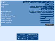
This uses a three-column preferences layout.
| Variable: | config.sample_sound | = None |
A sound file used to test the sound volume.
| Variable: | config.sample_voice=None | = None |
A sound file used to test the voice volume.
| Variable: | config.has_transitions | = True |
If True, the option to enable or disable transitions is shown.
| Variable: | config.has_cps | = True |
If True, the option to control text speed is shown.
| Variable: | config.has_afm | = True |
If True, the option to control auto-forward mode is shown.
| Variable: | config.has_skipping | = True |
If True, the option to control skipping read messages or not is shown
| Variable: | config.has_skip_after_choice | = True |
If True, the option to control skipping after choices is shown
| Variable: | config.always_has_joystick | = False |
If True, the link to the joystick page is always active.
| Variable: | config.has_joystick | = True |
If True, the link to the joystick page is shown.
| Function: | layout.two_column_preferences | (): |
This uses a two-column preferences layout. Configuration variables are the same as for layout.classic_preferences.
| Function: | layout.one_column_preferences | (): |
This uses a one-column preferences layout. Configuration variables are the same as for layout.classic_preferences.
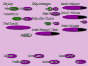
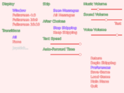
| Function: | layout.imagemap_preferences | (ground, idle, hover, selected_idle, selected_hover, hotspots): |
This layout uses an imagemap to handle preferences.
ground - The displayable used for disabled buttons, and areas that are not in a hotspot.
idle - The displayable used for unfocused unselected hotspots.
hover - The displayable used for focused unselected hotspots.
selected_idle - The displayable used for unfocused selected hotspots.
selected_hover - The displayable used for focused selected hotspots.
hotspots - A list of tuples defining the hotspots. Each tuple consists of
- The x-coordinate of the left side.
- The y-coordinate of the top side.
- The x-coordinate of the right side.
- The y-coordinate of the bottom side.
- The function of this hotspot.
There are two kinds of hotspots, buttons and bars. The buttons are:
- "Window", "Fullscreen" - The display preference.
- "All", "Some", None" - The transition preferences.
- "Joystick" - The button used to jump to the joystick preferences.
- "Seen Messages", "All Messages" - Control which messages are skipped.
- "Begin Skipping" - Forces skipping to begin.
- "Stop Skipping", "Keep Skipping" - Control skipping at menus.
- "Sound Test", "Voice Test" - Test the corresponding audio channels.
The other type of hotspot is a horizontal bar. The selected images are used for the full portion of the bar, while the unselected images are used for the empty part of the bar. The known bars are:
- "Music Volume"
- "Sound Volume"
- "Voice Volume"
- "Auto-Forward Time"
- "Text Speed"
Hotspot functions may also include the untranslated names of game menu buttons. If at least one such button is defined, the navigation is not shown, and the imagemap is expected to define all relevant game menu buttons.
Despite the name, this function can take arbitrary displayables as well as images. The images or displayables used should be transparent to allow the navigation to show through, unless the game menu is defined here.
joystick_preferences layouts
The joystick_preferences layout are used to define the joystick preferences screen.
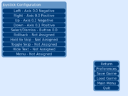
| Function: | layout.classic_joystick_preferences | (): |
The standard joystick preferences layout.
standalone layouts
These provide interesting functionality to Ren'Py games, and they stand alone, so it's possible to call as many of them as you want.
| Function: | layout.button_menu | (): |
This changes the in-game menus to use buttons defined in the current theme.
Defining New Layouts
This section contains some notes on how to define your own layouts. If you're not interested in defining your own labels, then you can safely ignore this section.
When it comes to defining layouts, there are two important principles you should follow:
- layout.provides must be called with the type of layout being defined, and it must be called before any theme function is called. For example, if a navigation layout is being defined, then layout.provides("navigation") should be called.
- The layout needs to implement the contract of it's layout kind. These contracts are described below.
While the default layouts are enable through the use of functions on the layout object, this is by no means the only way to supply a layout. For a user-defined layout, it should be enough to place the call to layout.provides in an init -2 python block, with the rest of the code residing in init blocks or labels as appropriate.
If your layout defines new configuration variables, you should set config.locked to False before creating them, and then back to True when you're done creating them. We suggest that configuration variables should be prefixed with the type of layout they're used by. Load/save variables should be prefixed by config.load_save_, navigation variables with config.navigation_ and so on. (For compatibility reasons, the default layouts do not conform to this standard.)
main_menu layouts
Main_menu layouts need to call:
layout.provides('main_menu')
Main menu layouts are expected to define a main_menu_screen label. This label is expected to:
- Show a fullscreen window of type mm_root. The code to do this is:
    python:
        ui.window(style='mm_root')
        ui.null()
- Create a keymap that disables the game_menu binding. (This is optional, but it can prevent transitions from the main menu to itself.)
    python:
        ui.keymap(game_menu=ui.returns(None))
- Displays the main menu on the screen. How this is done is generally up to the layout itself, but we strongly recommend you use config.main_menu to control the generation of the menu. Note that the documentation for config.main_menu says that bare strings cause a jump out of context to occur; use ui.jumpsoutofcontext to implement this properly. Using config.main_menu ensures that your layout will work even with extensions (like image galleries) that add options to the main menu.
navigation layouts
Navigation layouts need to call:
layout.provides('navigation')
Navigation layouts are expected to redefine the layout.navigation function. The way to do this is to first define a function in an init python block, and then assign that function to layout.navigation.
| Function: | layout.navigation | (screen): |
This function is intended to be set by a navigation layout. It's legitimate to replace this function with one of your choosing, provided the signature remains the same.
This function displays the navigation on the game menu. It's expected to set the background of the game menu. If screen is not None, it's also expected to display the navigation buttons defined in config.game_menu, highlighting the one named in screen.
It's suggested that your navigation function use config.game_menu to determine the game menu buttons to show to the user. (But note that the game menu is less often extended then the main menu, so this is correspondingly less important.)
load_save layouts
Load/save layouts need to call:
layout.provides('load_save')
Load/save layouts are expected to provide two labels: load_screen and save_screen, which are used to load and save, respectively. These screens should call layout.navigation with "load" or "save" as an argument, and are otherwise unconstrained in how they provide loading and saving functionality.
Please see the section on load/save functions for the functions that would be used to actually implement these screens.
yesno_prompt layouts
Yes/no prompt layouts need to call:
layout.provides('yesno_prompt')
Navigation layouts are expected to redefine the layout.yesno_prompt function. The way to do this is to first define a function in an init python block, and then assign that function to layout.yesno_prompt.
| Function: | layout.yesno_prompt | (screen, message): |
This function is intended to be customized by yesno_prompt layouts. It can be replaced by another function, provided the signature remains the same.
screen - The screen button that should be highlighted when this prompt is shown. If None, then no game menu navigation is shown.
message - The message that is shown to the user to prompt them to answer yes or no.
This function returns True if the user clicks Yes, or False if the user clicks No.
preferences layouts
Preferences layouts need to call:
layout.provides('preferences')
The preferences layout should define a preferences_screen label, which contains code to set the preferences. This screen should call layout.navigation("preferences"). It then needs to allow the user to alter the preferences, using the variables and functions defined in the preferences section. Finally, it should:
- Allow the user to begin skipping, by jumping to the _begin_skipping label.
- Allow the user to go to the joystick preferences, by jumping to the joystick_preferences_screen label.
joystick_preferences layouts
Joystick preferences layouts need to call:
layout.provides('joystick_preferences')
The preferences layout should define a joystick_preferences_screen label, which contains code to set the joystick preferences. This screen should call layout.navigation("joystick_preferences"). Unfortunately, the joystick preferences are undocumented at this time.
Example
An example of a new main_menu layout:
init -2 python:
    layout.provides('main_menu')

    style.mm_button = Style(style.button, help="main menu button")
    style.mm_button_text = Style(style.button_text, help="main menu button (text)")
    style.mm_button.size_group = "mm"

label main_menu_screen:
    python:
        layout.button(u"Start Game", "mm", clicked=ui.jumpsoutofcontext('start'), xpos=400, ypos=400)
        layout.button(u"Continue Game", "mm", clicked=_intra_jumps("load_screen", "main_game_transition"), xpos=450, ypos=430)
        layout.button(u"Preferences", "mm", clicked=_intra_jumps("preferences_screen", "main_game_transition"), xpos=500, ypos=460),
        layout.button(u"Quit", "mm", clicked=ui.jumps("_quit"), xpos=550, ypos=490)

        ui.interact()
Themes
Themes provide a simple way of changing the look of the main and game menus. A single function call applies styles to many of the elements of the main and game menus, giving a consistent look to the interface.
Theme functions should be called after the config.screen_width, config.screen_height, and library.script_version variables have been set, and after any layout functions have been called. They should be called before any style is changed by hand.
Theme Functions
These theme functions are
| Function: | theme.roundrect | (widget="#003c78", widget_hover="#0050a0", widget_text="#c8e1ff", widget_selected="#ffffc8", disabled="#404040", disabled_text="#c8c8c8", label=,"#ffffff" frame="#6496c8", window="#000000c0", text_size=None, small_text_size=None, mm_root=..., gm_root=..., less_rounded=False): |
This enables the use of the roundrect theme. By default, this theme styles the game in a blue color scheme. However, by supplying one or more of the parameters given below, the color scheme can be changed.
widget - The background color of non-focued buttons and sliders.
widget_hover - The background color of focused buttons and sliders.
widget_text - The text color of non-selected buttons.
widget_selected - The text color of selected buttons.
disabled - The background color of disabled buttons.
disabled_text - The text color of disabled buttons.
label - The text color of non-selected labels.
frame - The background color of frames.
mm_root - A displayable (such as an Image or Solid) that will be used as the background for the main menu.
gm_root - A displayable (such as an Image or Solid) that will be used as the background for the game menu.
less_rounded - If True, causes the buttons to appear less rounded in 800x600 mode (has no effect in 640x480 mode).
text_size - The size of text, such as button captions, labels, and prompts. Defaults to 18 if the screen is 640 pixels wide or less, and 22 otherwise.
small_text_size - The size of the text on large buttons. Defaults to 12 if the screen is 640 pixels wide or less, and 16 otherwise.
widget, widget_hover, disabled, and frame may either be single colors, or tuples containing two colors. In the latter case, a vertical gradient is used.
Component functions
The following functions exist to allow you to add elements of the roundrect theme to another theme. The other theme must have been set up before these functions can be used. Arguments are as for roundrect, except that all must be specified (no defaulting occurs).
- theme.roundrect_labels(text_size, label)
- theme.roundrect_frames(less_rounded, frame)
- theme.roundrect_buttons(text_size, less_rounded, widget, widget_hover, widget_text, widget_selected, disabled, disabled_text)
- theme.roundrect_large_buttons(text_size, less_rounded, widget, widget_hover, widget_text, widget_selected, disabled, disabled_text)
- theme.roundrect_prompts(text_size, label)
- theme.roundrect_bars(widget, widget_hover)
| Function: | theme.outline | (inside="#fff", idle="#e66", hover="#48f", selected="#84f", insensitive="#ccc", label="#484", prompt="#484", background="#fee", large_button="#fff8f8", text_size=22, small_text_size=16): |
This function selects a theme that is based on outlining text in different colors.
inside - The color of text inside the various outlines.
idle - The outline color of the text of an idle button or bar.
hover - The outline color of a hovered button or bar.
selected - The outline color of a selected button.
insensitive - The outline color of an insensitive button.
label - The outline color of a label.
prompt - The outline color of a prompt.
background - A displayable used for the game and main menu backgrounds.
large_button - The background color of large backgrounds.
text_size - The size of large text. (Used for buttons, labels, and prompts.)
small_text_size - The size of small text. (Used in large buttons.)
Component functions
The following functions exist to allow you to add elements of the outline theme to another theme. The other theme must have been set up before these functions can be used. Arguments are as for theme.outline, except that all must be specified (no defaulting occurs).
- theme.outline_frames()
- theme.outline_buttons(inside, idle, hover, selected, insensitive, text_size)
- theme.outline_large_buttons(inside, idle, hover, selected, insensitive, text_size, large_button)
- theme.outline_prompts(inside, prompt, text_size)
- theme.outline_labels(inside, label, text_size)
- theme.outline_bars(inside, idle, hover)
| Function: | theme.ancient | (): |
This is a theme that attempts to emulate the theme used by Ren'Py 6.5.0 when no theme was explicitly specified.
Theme Modifiers
These are functions that can be called after a theme function, allowing you to change a portion of a theme.
| Function: | theme.image_buttons | (d): |
Used to define buttons in terms of 5-tuples of image filenames. This expects its single parameter, d, to be a dictionary mapping untranslated button names to 5-tuples. Each 5-tuple should contain 5 filenames, giving the image used for the button when:
- The button is idle.
- The button is hovered.
- The button is selected and idle.
- The button is selected and hovered.
- The button is insensitive.
in that order.
| Function: | theme.image_labels | (d): |
Replaces labels with images. This takes a single parameter, d, which is expected to be a map from the text of a label to an image file.
Custom Theme
It's also possible to define your own Ren'Py theme. A custom theme consists of Ren'Py code that does the following.
- Calls layout.defaults() to initialize the layouts. Calling this function is the responsibility of the theme, and custom themes must also do it.
- Set up the base styles to reflect the requirements of the theme.
Often, the base styles come in name/name_text pairs. In these cases, name represents a Button or Window with style name, in which a Text with style name_text lives.
The base styles are:
- style.frame (inherits from style.default)
- Used for frames on top of which the rest of the interface can comfortably sit.
- Used for buttons, especially buttons whose primary purpose is navigating through the interface. (Like the main menu and the game menu navigation buttons.)
- Used for smaller navigation buttons. It might make sense to set a minimum width on buttons, but small_buttons should be allowed to shrink as small as possible.
- Used for buttons that are arranged in a group, such that only one of the buttons in the group can be selected at a time.
- Used for buttons that toggle their selected state to indicate if an option is set or not. (These aren't used in any of the pre-defined layouts.)
- Used for large buttons, such as file picker entries, that can contain a large amount of text and other information.
- style.label (inherits from style.default)
- style.label_text (inherits from style.default)
- Used for labels, which are small text messages that never change.
- style.prompt (inherits from style.default)
- style.prompt_text (inherits from style.default)
- Used for prompts, longer text messages which may change at runtime.
- style.bar (inherits from style.default)
- style.vbar (inherits from style.default)
- Used for horizontal and vertical bars, respectively. Bars are generally intended to indicate a quantity or an amount of progress, but aren't expected to be adjusted by the user.
- style.slider (inherits from style.default)
- style.vslider (inherits from style.default)
- Used for horizontal and vertical sliders, respectively. Sliders are bars that are used to adjust a value.
- style.scrollbar (inherits from style.default)
- style.vscrollbar (inherits from style.default)
- Used for horizontal and vertical scrollbars, respectively.
- style.mm_root (inherits from style.default)
- style.gm_root (inherits from style.default)
- Used for the backgrounds of the main and game menus, respectively.
Generally, themes should not adjust the margins, positioning properties, or maximum sizes of these styles. An exception is that the bars are expected to set a maximum size in a direction perpendicular to the orientation of the bar (ymaximum for bar and scrollbar; xmaximum for vbar and vscrollbar). No limitations apply to the _text styles.
Main and Game Menus
This section describes how the content of the various menus can be customized. If you just want to change the look of the menus (to the extent made possible by the style system), use themes or styles. In particular, if you want to change the image background to the main menu and game menu, use the properties mm_root and gm_root in a theme.
To change just the text of menu items, consider using config.translations. To change the screens on the menus, you'll need to change the contents of the config.main_menu and config.game_menu variables. Otherwise, you'll want to use a layout that changes the look of the menus, or write your own layout.
Main Menu
The main menu can be customized by setting the config.main_menu variable. This variable should be a list of tuples. The first component of each tuple is the name of the button on the main menu. The second component can be one of three things:
- a string, in which case it is a label at which the game execution starts (after a jump out of the menu context).
- a function, in which case the function is called when the button is clicked.
- Finally, it can be None, which causes the button to be insensitive.
The third component must be a string containing a python expression, which determines when the button is enabled. The optional fourth component is a string containing a python expression, that determines if the button is shown at all. (changed in 6.6.2)
To jump from the main menu to one of the screens in the game menu, one should use the _intra_jumps function to specify the appropriate transition.
| Function: | _intra_jumps | (label, transition): |
Jumps to label while remaining in the same context.
transition should be a string giving a field on the config object. When this function is run, that field is accessed, and is used to specify the transition that is used.
The default value of config.main_menu is:
    config.main_menu = [
        (u"Start Game", "start", "True"),
        (u"Continue Game", _intra_jumps("load_screen", "main_game_transition"), "True"),
        (u"Preferences", _intra_jumps("preferences_screen", "main_game_transition"), "True"),
        (u"Quit", ui.jumps("_quit"), "True")
        ]
Game Menu
The first thing one may wish to do when modifying the game menu is to add a screen to it. This is done in two steps. The first is to create the screen, and the second is to add it to the config.game_menu list so that it can be reached from the game menu.
Each screen is represented in the code as a label that is jumped to to display the screen. There are five steps that this label should do in order to display the screen. First, it should call layout.navigation(screen), where screen is the name of the screen (the first component of the tuples in config.game_menu, described below). Second, it should call the ui functions to add components to the the screen. Third, it should call ui.interact to interact with the user. Fourth, it should examine the results of _game_interact, and react appropriately. Finally, it should jump back up to the screen label, showing the screen again after each interaction.
So that the user can see it, the screen should be added to config.game_menu. This is a list of four- or five-component tuples. The first is the name of the screen. It's used to determine if the button used to reach that screen should be indicated as selected. The second component is the text used for that button. The third component is a function that executes when the button is clicked. Normally, an appropriate function is _intra_jumps(label, transition), where label is the name of the label of your screen. The fourth component is a string containing a python expression. If the expression is not true, the button is insensitive. The optional fifth component is also a string containing a python expression. If the expression is not true, the button is not shown. (changed in 6.6.2)
The default value of config.game_menu is:
    config.game_menu = [
        ( None, u"Return", ui.jumps("_return"), 'True'),
        ( "preferences", u"Preferences", _intra_jumps("preferences_screen", "intra_transition"), 'True' ),
        ( "save", u"Save Game", _intra_jumps("save_screen", "intra_transition"), 'not main_menu' ),
        ( "load", u"Load Game", _intra_jumps("load_screen", "intra_transition"), 'True'),
        ( None, u"Main Menu", ui.callsinnewcontext("_main_menu_prompt"), 'not main_menu' ),
        ( None, u"Quit", ui.callsinnewcontext("_quit_prompt"), 'True' ),
        ]
| Variable: | _game_menu_screen | = "_load_screen" |
One can customize the screen the game menu jumps to by default by changing the value of _game_menu_screen. For example, one could set this to "load_screen" for the first few interactions, and then set it to "save_screen" for the rest of the game. This is especially useful for a game with no main menu.
If set to None, the user cannot enter the game menu. This is set to None at the start of the splashscreen, and reset to its old value when the splashscreen completes.
Use the layout.yesno_prompt function to ask yes/no questions of the user.
| Function: | layout.yesno_prompt | (screen, message): |
screen - The screen button that should be highlighted when this prompt is shown. If None, then no game menu navigation is shown.
message - The message that is shown to the user to prompt them to answer yes or no.
This function returns True if the user clicks Yes, or False if the user clicks No.
Pre-defined Screens. Layouts define the load screen, save screen, and preferences screen are define at the load_screen, save_screen, and preferences_screen, respectively.
Please see the page on Saving, Loading, and Rollback for a list of functions that can be used in the load and save screens, and the page on the Preferences for a list of preferences that can be customized.
Jump to _return to return to the game or the main menu, as appropriate. Jump to _noisy_return to play config.exit_sound before returning.
Entering the Game Menu
The game menu can be activated immediately using renpy.game_menu, or ui.gamemenus can be used to enter the game menu when a button is clicked. Both functions take an optional argument, the name of the screen to enter, normally one of "load_screen", "save_screen", or "preferences_screen". This can be omitted to use the default screen.
init python:
    def overlay():
         ui.textbutton("Prefs", clicked=ui.gamemenus("preferences_screen"), xalign=1.0, yalign=0.0)

    config.overlay_functions.append(overlay)

label battle_begin:
    menu:
        "A battle is about to begin! Would you like to save your game?"
        "Yes.":
              $ renpy.game_menu("save_screen")
        "No.":
              pass
Compatibility Mode
Ren'Py also supports a compatibility mode that makes layouts and themes more compatible with how they were used in Ren'Py 6.5.0. This compatibility mode is automatically enabled when config.script_version is set to (6, 5, 0) or less. It can also be enabled explicitly by calling layout.compat().
| Function: | layout.compat | (): |
This enables a compatibility mode that sets up themes and styles as they were used in Ren'Py 6.5.0 and prior versions.
